Creating a peaceful and relaxing atmosphere in your home starts with thoughtful color choices. Calm colors have the power to soothe your mind, reduce stress, and make your living space feel welcoming. Whether you’re painting a single room or redecorating your entire house, choosing the right calm colors can transform your environment into a sanctuary. In this post, we’ll explore helpful tips to guide you in selecting serene hues that promote relaxation and harmony.
What Are Calm Colors?
Calm colors are typically soft, muted shades that evoke a sense of tranquility. They are often found in nature—think gentle blues of the sky, soft greens of leaves, or warm neutrals like beige and cream. These colors help reduce visual noise and create a sense of balance in a room.
Common Calm Color Families
– Blues: Often associated with serenity and clarity
– Greens: Remind us of nature and growth
– Neutrals: Warm whites, beiges, and grays add understated comfort
– Soft Pastels: Light pinks, lavenders, and peaches can feel gentle and inviting
Tips for Choosing Calm Colors for Your Home
1. Consider the Room’s Purpose
Start by thinking about what the room is used for. Calm colors should complement the function of the space:
– Bedrooms: Soft blues, pale greens, or lavender promote restful sleep.
– Living Rooms: Warm neutrals or muted greens encourage conversation and relaxation.
– Home Offices: Light blues or soft grays can enhance focus without feeling sterile.
– Bathrooms: Pale aqua or sandy beige create a refreshing, spa-like feel.
2. Use Color Psychology as a Guide
Colors can influence emotions and moods. While preferences vary, certain colors generally evoke calm feelings:
– Blue: Known to lower blood pressure and slow breathing.
– Green: Symbolizes renewal and balance.
– Lavender: Gentle and soothing, sometimes linked to reduced anxiety.
– Warm Neutrals: Provide a cozy and secure atmosphere.
3. Test Color Samples at Different Times
Lighting can dramatically change how a color looks in your space. Paint small swatches on the wall and observe:
– How the color appears in natural daylight versus evening light
– How it looks with your room’s lighting fixtures turned on
– How it interacts with your existing furniture and décor
4. Opt for Muted Tones Instead of Bright Shades
Bright or highly saturated colors can feel overwhelming and energetic, which works against calmness. Instead, choose shades that are toned down by mixing with gray, beige, or white to soften them.
5. Balance Bold Accent Colors with Calm Base Colors
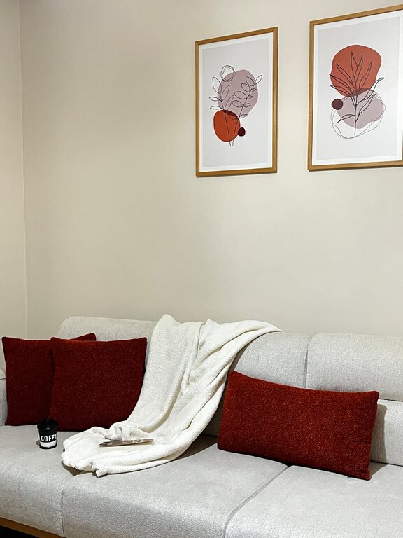
If you love a particular bold color, incorporate it in small doses through accessories like cushions or artwork. Balance these accents with calming base colors on walls and larger furnishings to avoid overstimulation.
6. Coordinate Colors with Natural Elements
Bringing nature indoors can enhance the calming effect of your color choices. Pair your calm wall colors with:
– Wooden furniture or floors
– Plants and greenery
– Natural fibers like cotton, linen, or wool
This connection to nature helps create a peaceful and grounded atmosphere.
7. Consider Paint Finishes for a Softer Look
Flat or matte finishes reflect less light and create a soft, cozy feel. Avoid high gloss paints in calm spaces, as their shine can draw too much attention and disrupt the tranquil mood.
8. Create Color Harmony with a Palette
Choose a small selection of complementary calm colors to use throughout your home. This creates cohesion and flow between rooms. For example, soft blue walls, off-white trim, and pale gray accents work well as a harmonious palette.
How to Apply Calm Colors Beyond Walls
Colors don’t only come from paint. Here’s how to incorporate calm tones in other ways:
– Furniture: Choose upholstered pieces in tranquil colors like pale blue or muted green.
– Textiles: Use curtains, rugs, pillows, and throws in soft shades and comfortable textures.
– Artwork: Select calming images with gentle color schemes.
– Decor: Candles, vases, and frames in soft neutral tones support the overall peaceful aesthetic.
Final Thoughts
Choosing calm colors for your home doesn’t have to be complicated. Remember to:
– Prioritize your room’s mood and function
– Opt for muted, nature-inspired tones
– Test colors in your actual lighting conditions
– Combine calm base colors with subtle accents
– Bring in natural textures and materials
With these tips, you can create a space that feels restful, welcoming, and truly yours. Enjoy the process of designing a home that supports your well-being through the thoughtful power of calm colors!